
The Challenge
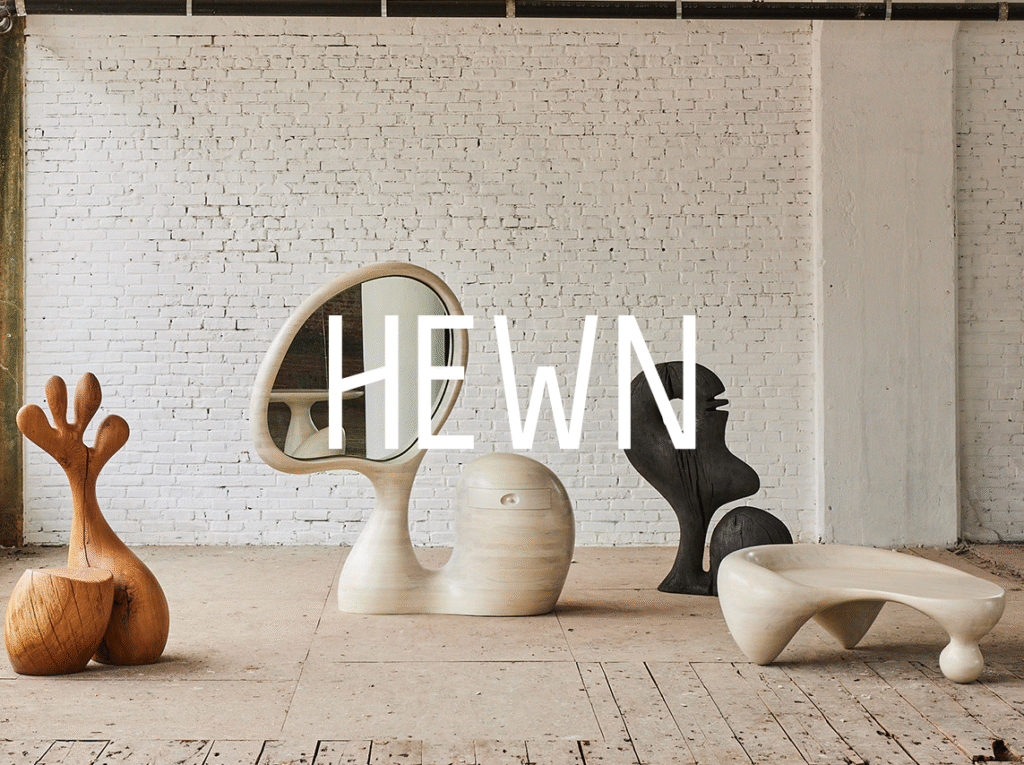
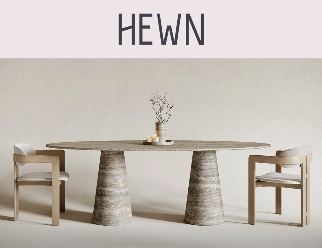
Hewn is a new Brooklyn-based furniture studio creating sculptural, small-batch pieces from raw materials like stone, charred wood, and concrete. The founder approached me to craft a visual identity that would reflect the studio’s philosophy: permanence, restraint, and the beauty of imperfection.
They wanted the brand to feel timeless, architectural, and grounded, something that would resonate with interior designers, high-end boutiques, and design-conscious homeowners.
The identity needed to be flexible across print, product, and digital, yet quiet enough to let the furniture speak.
The Approach
I began by immersing myself in the textures and tones of brutalist architecture, wabi-sabi principles, and traditional woodworking methods. From there, I developed a visual foundation built on contrast: weight and silence, roughness and precision, permanence and imperfection.
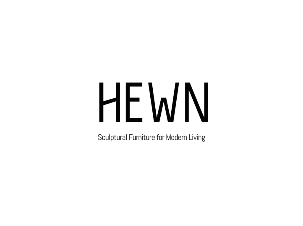
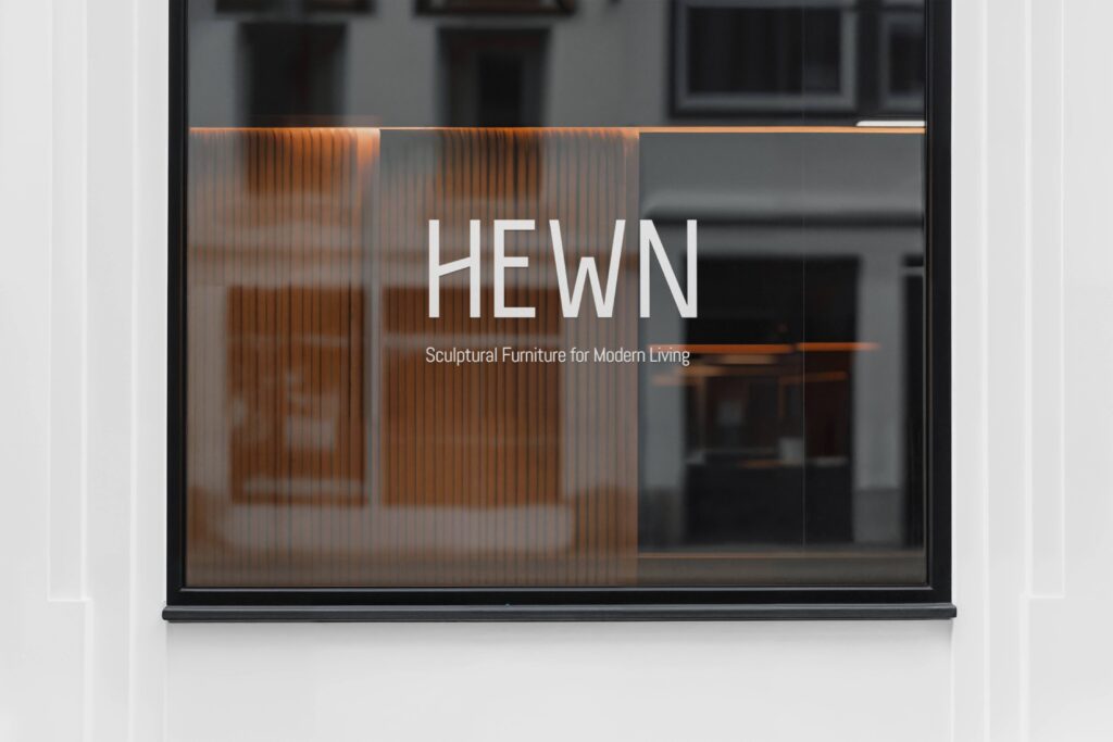
- Logo: The wordmark uses custom-modified letterforms inspired by stone carving and vernacular signage. It’s intentionally heavy, stable, and simple, able to be engraved, stamped, or etched without losing integrity.
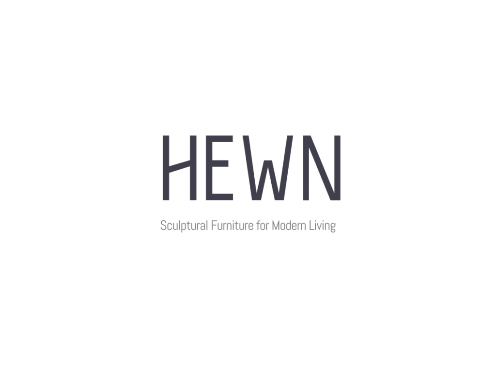
- Typography & Color: I selected a minimal typographic system with a focus on negative space, paired with a muted, earthy palette: off-white limestone, matte black stone, and soft mineral pinks.
The Outcome
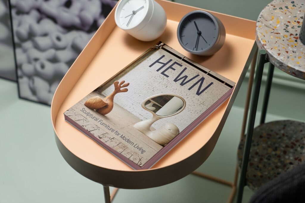
The final identity communicates both the material honesty and quiet confidence of the brand. It functions well across media: from digital touchpoints to physical labels, product stamps, and studio collateral.
Need some help for your brand? Let me know: hello@jperet.com