
Project Brief
Driftwood & Iron is a Portland-based furniture studio specializing in handcrafted pieces made from reclaimed wood and industrial metals. The client approached me to create a full visual identity that reflects the brand’s values: sustainability, craftsmanship, and rugged elegance. The challenge was to create a visual language that bridges rustic authenticity with modern sophistication, something that would speak to eco-conscious homeowners who value quality and design.
Scope of Work
- Brand Discovery & Mood Boarding
- Primary & Secondary Logo Design
- Brand Color Palette
- Typography System
- Tagline Development
- Storefront Mockups
Tagline:
“Built to Hold Stories.”
This line captures the essence of Driftwood & Iron: timeless, meaningful design that reflects the character of reclaimed materials and the lives they touch.
Logo Concept:
The logo fuses organic and industrial forms, mirroring the duality of the brand’s materials. The typography has a modern sans-serif (representing durability and clean design). The icon uses abstract shapes inspired by driftwood, designed to be memorable and versatile in print and digital.
Color Palette:
A warm, earthy palette grounded in nature and raw materials:
- Iron Black – for strength and contrast
- Light Brown – for natural, wooden feel
Typography
- Primary Typeface: Alexandria – a humanist sans-serif that brings warmth and structure
- Secondary Typeface: Space Grotesk – clean, modern, excellent for contrast and readability
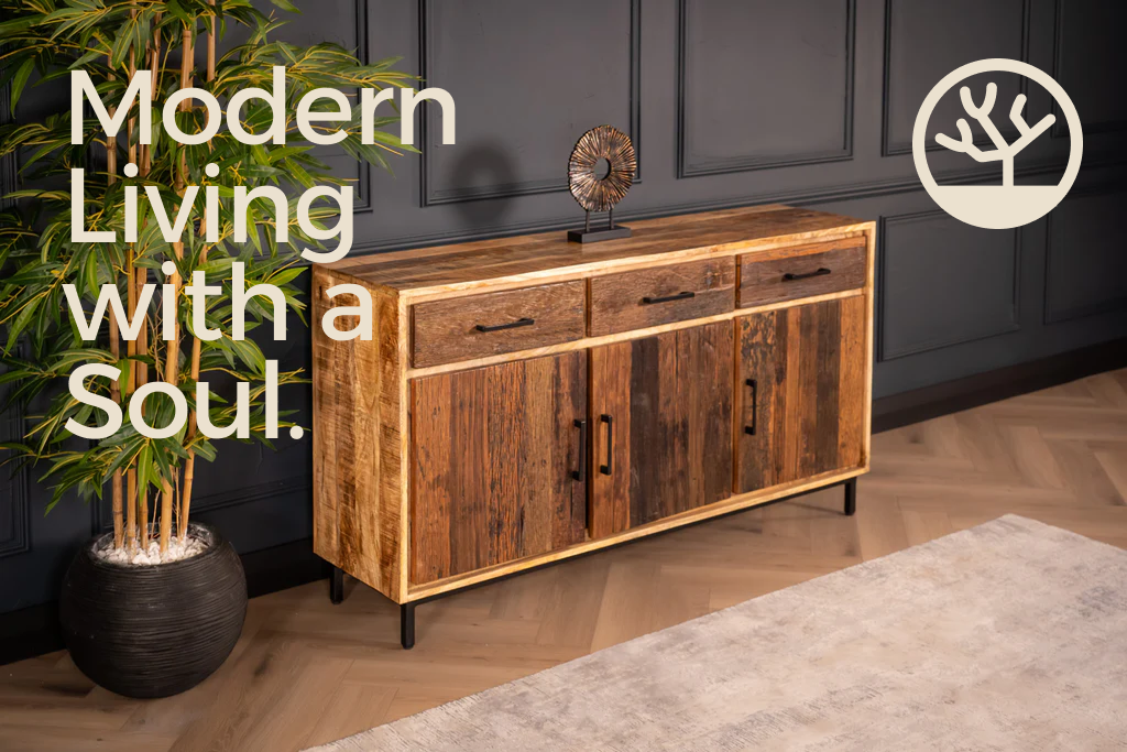
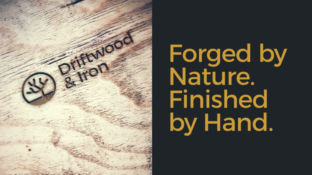
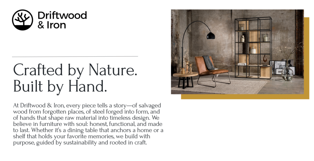
Design Gallery
Reflection:
This was a passion project rooted in material storytelling and meaningful design. The biggest success was creating a system that felt both raw and refined—like the furniture itself. It demonstrates my approach to branding that honors the craft behind a business, not just its image.